We’re happy to tell you that, based on your feedback and our research, we were able to vastly improve the Appraisal Review Checklist in RealView, and we’ll be rolling out these updates over the next few weeks. There are several changes which we hope you’ll find are a natural evolution of the interface you use today, making your best tools more accessible with improved visual cues throughout.
Below, you see the two views side by side, just to give you a feel for what has moved, and where. You’ll find that the approach to the checklist hasn’t changed much, but we’ve taken care to bring greater visibility to important items with a more modern and attractive interface.
Click to see a larger view of the current and new checklist versions.
More than just a makeover, there are some very specific improvements to functionality, so let’s take a closer look.
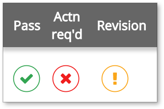
At the top of the checklist, you’ll see three new columns: Pass, Actn req’d, and Revision. The items in these columns provide information and let you interact with each rule in the list.
A green check mark in the Pass column will indicate that field was marked as passed by either RealView’s automated check or your QC staff.
The X in the Actn req’d column toggles to red when RealView determines a rule needs further review, or when clicked by a reviewer. When action is required, the reviewer will likely want to offer an explanation, which is a perfect use for the Internal comments field. Anything you type here is visible only to your team members - not vendors or anyone else - so it’s ideal for any explanation specific to a rule.
The exclamation mark in the Revision column will be orange when activated, and the corresponding Revision instructions field will appear, allowing you to communicate with the vendor about your expectations for that checklist rule.
Any of these icons may have a striped background indicating the state of that field when RealView was originally run, which is great for research purposes after multiple QC reviews. This is indicated using the Pre column in the current checklist.
A second row with a transparent icon shows the results of RealView’s previous review of an appraisal with a matching filename & appraiser license number. This is an option, so if you'd like to have it turned on, please contact us.
As you enter comments in any field, you’ll see the save icon appear to the right, allowing you to save the information. As before, you can also click SAVE MY WORK at the top to save all changes.
Also at the top, the Expand all, Collapse all, and Summary buttons look a little different, and the filtering options are all available by clicking the Filter icon. By default, the filters are configured to help users focus on rules which have not been marked as Passed but those selections can be changed at any time by the reviewer. This is part of our effort to streamline the interface so your team stays fast and efficient.
Those are the major changes, although it’s not an exhaustive list. There are other small differences such as the SAVE & EMAIL ACTION REQUIRED button is now called Save and send revisions, which more accurately reflects the distinction between Action Required (for internal purposes only) and Revision (the request sent to the vendor).
You may have noticed in the screenshots a section called Appraiser comments which is part of a tool called RealView Bridge, targeted at reducing revision requests—you can read more about that on this page.
Once you’ve had a chance to use the new design, we’d love to hear what you think! We’ll be using a phased rollout over the next few weeks, so you might not see these changes immediately, but if you’d like to see the new checklist right away, contact Client Relations at 1-800-900-4954.


